Optimizing feed to scale millions of active primary users
Led design on the distribution/scale team, focusing on the consumer-side strategy (e.g. readers), owning Quora's feed reading experience, content distribution, and machine learning systems from 2021-2023.
Worked with the machine learning & ranking teams to understand how to design and implement UIs for complex ML systems.
Team of 1-2 PMs, 1-2 designers, 6-8 engineers, 3-4 data scientists.
Worked with the machine learning & ranking teams to understand how to design and implement UIs for complex ML systems.
Team of 1-2 PMs, 1-2 designers, 6-8 engineers, 3-4 data scientists.
The primary goal for feed design is to maximize the feed reading experience for users, providing them with the highest value stories, while optimizing for a system driven by machine learning (ML) models, measured by the increase and satisfaction of user engagement.
Quora's feed not only provided expected content, based on a follow graph of users or topics, but speculative, explorative content algorithmically developed through ML models inferring what type of content a user would most likely be interested in. Feed design was responsible for extracting explicit (and implicit) users signals for these ML models to be able to optimally show the most engaging content to a user.
In this project, I focused on understanding what levers to pull to maximize increasing user engagement on feed. This led to redesigning feed story feedback and engagement mechanisms for our ML models to utilize, to increase feed usage and engagement through providing clearer, higher volume signals.
Overall Impact: Through a number of experiments and projects, the feed design team had contributed significantly towards increasing monthly active users by ~10% year over year, scaling from ~300 to ~400 million users over three years, resulting in a ~$1M increase in revenue per year.Orienting the feed experience
Quora consists of two types of consumers, or readers: primary, or active users who directly visit feed, and secondary, or users who visit from secondary sources, such as Google or Quora's Digest emails.
Feed design focuses on increasing feed engagement and participation for primary users. Though the majority of traffic comes from secondary users, revenue is driven by primary users.
Feed design focuses on increasing feed engagement and participation for primary users. Though the majority of traffic comes from secondary users, revenue is driven by primary users.
In order to increase feed engagement, machine learning and ranking focused on improving feed content through signal collection.
"How can design increase feedback participation rates, volume, and retention on feed from primary users to optimize ranking to show more personalized and engaging content?"
Feed story architecuture
The different feed story types and its components

How design influences capturing ML signals
Machine learning is a method to make predictions based on some set of previous data points. Feed systems are dependent on ML models, which heavily rely on getting feedback from users to learn what is most relevent and engaging content for them. Serendipitous discovery in feed that aligns with personal interests generally creates the highest value and retention.
Design x ML signals principles
Design enables ML to provide engaging content by building interfaces that capture user intent, which are interpreted through signals. The following principles were established to guide the type of signals design needed to capture for the ML models.
1 – Explicitness
How clearly the user's intent is captured through an action
How clearly the user's intent is captured through an action
Explicit signals, like selecting an action, give more confidence for a model to make the right decision, while implicit signals, like analyzing dwell time on content, provides more volume.

2 – Frequency
How often a user repeats an action that is providing a signal
How often a user repeats an action that is providing a signal

3 – Attributability
How accurately an action can be attributed to a signal
How accurately an action can be attributed to a signal
The more explicit the action, the more accurately it can be attributed to a signal.

4 – Consistency
The ability to measure the signal over and over again by the same action
The ability to measure the signal over and over again by the same action

Solution #1: Optimizing the action bar
The most explicit, frequent, consistent, and attributable feed signal
The most explicit, frequent, consistent, and attributable feed signal
The primary method to give explicit feedback on stories, with the lowest amount of effort and highest ROI, is engaging with the action bar. Upvoting indicates positive sentiment and content that should to distributed to other users. Downvoting signifies negative sentiment for content that should not be distributed to others, while hiding indicates personal disatisfaction.
User research indicated "users were frustrated for not seeing the immediate impact of their actions" and "the action bar was cluttered and overwhelming to parse".
By increasing partipation and usage on feed story actions, users are more likely to be sticky by actively engaging with content, than endlessly doom scrolling. It also gives control to tailor feed to show the most relevant, interesting content.

Previous feed story action bar design (pre- and post-expand)
a. Consolidating internal and external share entry-points
To maximize prioritizing the most valuable actions with limited real estate , internal and external sharing options were merged into one in the action bar. Internal shares would re-share content to one's feed or Space, while external shares would share content onto other platforms. Inconsistent desktop and mobile share flows were also unified.
Desktop approach
Previously, the external share component displayed a limited set of social platform, along with a copy link option to share to platforms not listed. Copy link option had >85% usage, compared to social platforms sharing options, with a combined usage of <15%

Option 1: add copy link to overflow (launched design)
Moved "copy link" to the overflow menu and removed the sparsly used social platform sharing options.
Impact:
- Initially, desktop external shares decreased, but recovered after ~2 weeks with the "copy link" option. After ~4 weeks, external shares increased by +0.3%.
- +0.2% increase in upvotes validated the hypothesis that a simplified action bar could boost usage.

Option 2: consolidate all sharing mechanisms within the share button
Unified both internal and external shares into one entry-point, resulting in a significant drop in internal shares, -15% decrease in content generation, and no significant impact on external shares.

Left – Variant 1: option to internally share or copy link
Middle – Variant 2: internally share or externally share to a social platform
Right – Variant 3: internally share directly or with additional content
Middle – Variant 2: internally share or externally share to a social platform
Right – Variant 3: internally share directly or with additional content
Option 3: move external social share options to the overflow menu
Significant decrease in overflow menu options, such as bookmarking, and slight decrease in external shares.

Left – Variant 1: external share options above overflow menu options
Right – Variant 2: overflow menu options above external share options
Right – Variant 2: overflow menu options above external share options
Mobile approach
Previous mobile share flow

Option 1: move external native share modal entry-point to overflow (launched design)
Leveraged native design patterns to share content externally, and have consistency with desktop. Initial drop in external shares, but after ~2 weeks, users adapted with no negative effects to metrics.

Option 2: consolidate all sharing mechanisms within the share button
Unified both internal and external shares into one entry-point, resulting in a significant drop in internal shares. Running an experiment de-risked the engineering effort to design a custom overflow menu with a share composer.

Left – Variant 1: share menu with internal and external share options
Middle – Variant 2: external share composer preview
Right – Variant 3: full external share composer
Middle – Variant 2: external share composer preview
Right – Variant 3: full external share composer
b. Experimenting with different action bar UIs
Consolidating internal and external share entry-points unblocked real estate to experiment new action bar UIs. Users are more likely to engage with actions when they have more confidence in knowing what they do.
The primary goal was to increase upvote and downvote engagement and participation rates by simplifying the action bar and clarifying what the actions represent.
The primary goal was to increase upvote and downvote engagement and participation rates by simplifying the action bar and clarifying what the actions represent.
Adding the "upvote" label (launched)
Hiding and downvoting content combined had 2x more usage than upvoting content. By adding an "upvote" label to the upvote button, new users can learn what this button represents, and reinforces old users to engage with the button more with a higher level of confidence.
Impact: Upvote participation increased by +2.1%, resulting in an overall +2.4% increase in upvotes. Downvote participation increased by +4.2%, resulting in an overall +5.4% increase in downvotes. Hides also went up by ~10%.

Left – Variant 1: using old split button design without a border
Right – Variant 2 (launched): testing new split button with a border for consistency with the design system
Right – Variant 2 (launched): testing new split button with a border for consistency with the design system
Positive signaling action representations
Quora uses an upvote/downvote mechanism for content signaling, while some of the largest social internet products use "likes", signified through a thumbs up or heart icon. One hypothesis to increase engagement was to test more commonly used positive signaling UI patterns.
Impact: Overall, there was a little to no increase to positive signaling, while negative signaling drastically decreased, resulting in a drop in feed engagement as the ML models heavily rely on this signal.

Left – Variant 1: add a like/dislike button, similar to Facebook
Right – Variant 2: represent positive signaling with a heart button, similar to Instagram and Twitter,
and remove negative signaling from the action bar
Right – Variant 2: represent positive signaling with a heart button, similar to Instagram and Twitter,
and remove negative signaling from the action bar
Consistent action button style variants
The current upvote/downvote button contradicts the split button design system guidelines, with a primary icon color. This experiment tests consistent button styles within the design system, hoping to enhance user scannability between stories and facilitate quicker navigation to preferred content to potentially increase feed scroll depth and time.
Impact: Overall, each variant showed drastic negative drops in either action engagement or partipation rates, or overall feed engagement. As a result, the team decided the benefit of contradicting the design system in this use case outweighed the benefit to create consistency.

Left – Variant 1: testing a grey split button
Right – Variant 2: testing all grey pill buttons
Right – Variant 2: testing all grey pill buttons

Left – Variant 3: testing a white split button
Right – Variant 4: testing all white pill buttons
Right – Variant 4: testing all white pill buttons
Adding labels to all actions & clarifying metadata information
Adding an upvote label had a major positive impact on upvote metrics, so this experiment tested adding labels to all actions in the action bar. It also made some of the actions more actionable, such as the "Comment" button opening the "Add comment" input.
Metadata information was extracted to be shown as its own section on a pre-expanded story, making it more readable for the user. Users can engage more dynamically with this information, by as viewing the list of upvoters or expanding comments directly.
Impact:
While all actions (upvotes, downvotes, comments, shares) showed positive engagement metrics, feed engagement, reading, and revenue metrics showed huge drops and negative engagement. Follow-up experiments with data were planned to understand this inverse relationship.
While all actions (upvotes, downvotes, comments, shares) showed positive engagement metrics, feed engagement, reading, and revenue metrics showed huge drops and negative engagement. Follow-up experiments with data were planned to understand this inverse relationship.

Solution #2: Improving feedback response menus
While upvoting, downvoting, and hiding content provides valuable positive and negative signaling, it does not allow the ML algorithms to appropriately categorize the feedback, as it does not understand the "why". When users upvote content, does that mean they are interested in seeing more like it or not? Does downvoting content mean they're not interested in that specific piece of content, the topic, or the author?
Feedback response menus were crucial to follow-up and understand why a user chose a specific action. These follow-up responses would allow the algorithms to better categorize the type of feedback it was being fed.
Feedback taxonomy
List of story actions and how its feedback is categorized

The platform needs to determine when to receive positive and negative signals publicly vs. privately and the implications it would have on the UI and ML ranking models by understanding whether that feedback was to improve the user's or the system's experience and what content type it applies to.
The two main affordances for users to give additional feedback on a story are:
- After giving negative feedback, such as hiding content, through a post-action feedback response menu with follow-up actions
- From the overflow menu, showing additional options, such as "Thank" and "Downvote Question"
a. Post-action feedback response menus
The previous post-action feedback menus were unengaging and had redundancies, dead-ends, and unclear language and actions.
The goal was to increase overall participation and individual usage rates of these feedback mechanisms through designing a clearer system. ML models would use this increased feedback to provide more relevant feed content by better understanding a user's intent on why they engaged with a story, contributing towards overall feed engagement metrics.

Previous design of the
post-action feedback response menu
post-action feedback response menu
Consolidation, simplification, explainability, and scannability
- Consolidating actions to remove redundanciesby repurporsing the redundant "downvote answer" option to "not interested in this answer" and re-grouping the options' hierarchy based on importance and to match feed story content architecture
- Simplifying language for consistent copy by defining rules for when to use "Not interested in..." vs "Mute..." and better explainability through additional explanatory text for selecting each option and its implications
- Better scannability and readibility by using icons and a background color for depth, to reduce cognitive load time for selecting an option


Negative signaling through downvoting flow
After downvoting an answer, a confirmation toast message is shown, without providing an option to read a satisfying answer to a question they may be interested in.
Rather than a dead-end state after downvoting, the feedback response menu for hiding content could be re-purposed to encourage more downvotes by mentioning its impact. Follow-up options could allow the user to either act upon the content further, by reporting it or muting the author, or explore and engage with the question by seeing other answers to it.
Impact: Huge increase in question page click-throughs, but a huge drop in feed engagement metrics, as the question page was not optimized to send users back to feed.

Users can see more answers to the question on the question page
b. Feed story overflow menus
Currently, the feed story overflow menus primarly consisted of showing secondary feedback actions and additionals action related to the story. Some of these secondary actions had high-value, such as "Bookmark", while others did not add much benefit to the user or the system. The menu was convuluted with minimally used options and a dense UI that made it difficult for users to easily parse and select an option, resulting in overall low-usage rates.
The primary goal of redesigning the overflow menus was to increase the time to selection and participation rates of the menu through improved scannability and optimizing options shown. The secondary goal was increase feedback rates by leveraging the UI to be expandable for custom components and options.

Previous design of the
feed story overflow menu
feed story overflow menu
Out with the old (options), in with the new
The first experiment focused on optimizing the current set of options shown. Through UXR and anaylyzing usage rates, the following options were removed from the menu:
- Translate answer
- Edit question: this is only shown on the question page now
- Thank: the platform wanted to encourage positive feedback and support for authors more publicly, through upvotes or comments
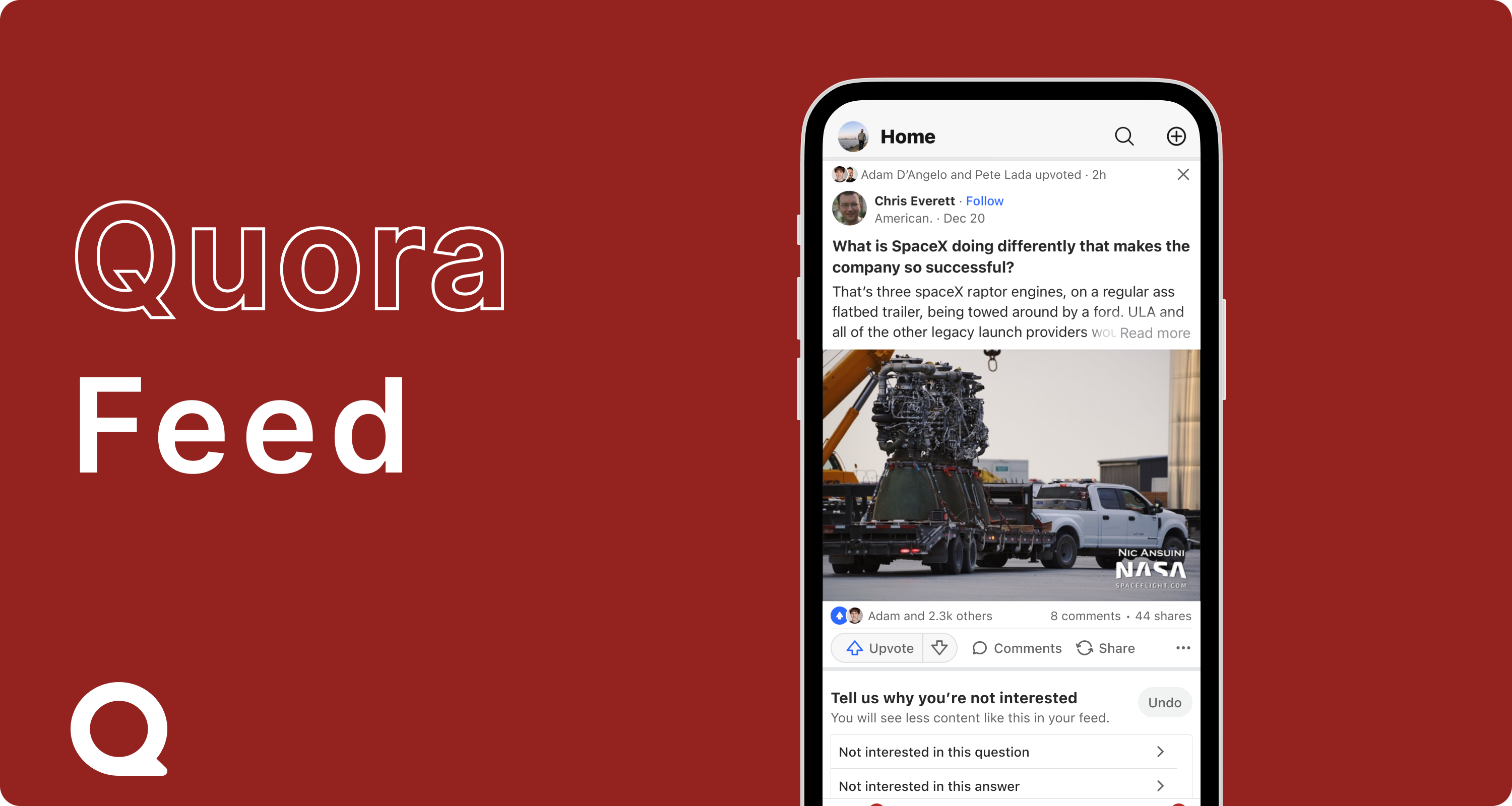
Additionally, in order to increase signal collection, "Not interested in this" was added to allow users to signify content they do not wish to see.
Impact:

Feed story overflow menu
after removing minimally, low-value options
and adding "Not interested in this"
after removing minimally, low-value options
and adding "Not interested in this"
A cleaner list view architecture
In order to have users engage more with the overflow menu, it needed to become more readable for users to quickly select the option they were looking for. The current overflow menu used outdated mobile design patterns, and built using web code, instead of native code. Aside from a cluttered UI, this also meant the overflow menu lacked native interactivity and performance. After a competitive analysis, the new overflow menu consisted of:
- Icons: helps with visually scanning different options
- Sections with titles: allows grouping of related options together
- Subtites: explains what the option is or it's impact as needed
Implementation: In order to de-risk the work of migrating the overflow menus from using web components to native, A/B tests were conducted building a quick web prototype, and using native capabilities to toggle the menu to gain its performance and interactive benefits. Seperate experiments were ran for desktop, testing the use of icons.
Impact: ~+10% increase in users selecting an option, ~-15% decrease in users opening and closing the menu without selection an option. The overflow menu is awaiting mobile staffing to be natively built and launched. On desktop, icons were launched.

Top: mobile variants testing titles, subtexts, icons, and grouping
for a more scannable list view
Bottom: desktop variant testing icons (launched)
for a more scannable list view
Bottom: desktop variant testing icons (launched)
Adding custom components and quick actions to overflow menus
A primary goal with redesigning the overflow menus was to increase user feedback and signal collection on content. While the current overflow menu offers static options to do so, extending the overflow menu to have the ability for quick actions and custom components could drastically increase signal collection with the ease of use and access to these options.
- Quick actions: actions that users frequent or have higher importance could be displayed as buttons, allowing the user to quickly select them without parsing through a list. These actions could include "see more/less", "not interested", downvoting, sharing, and bookmarking.
- Custom components: the overflow menu could be extended beyond just showing items in a list view or with buttons to adding custom components related to the type of content. For example, feed stories occasionally display a survey asking users to rate the content. The overflow menu could be include these surveys, allowing users to give more granular feedback quickly. For share overflow menus, a custom inline share composer could be shown. Annoucements, disclaimers, or other banners related to the story could also be included here.

Potential directions for quick actions and custom components